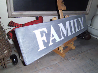
It's on a scrap of board that I found hiding under a pile of other boards. I painted it black, then white, then pewter gray. Next I lightly sanded it because I knew I was going to hand paint the letters in white, so I didn't want too much white showing through, and I like the subtleness of the sanding. Some places the paint is gone down to the board which helps give it character. Then of course I painted the letters. White letters on a dark color always looks bold but takes so many coats! I'm happy with how it turned out. But does it need the black shadow?? Well, thanks for stopping by.
Tuesday, June 14, 2011
A sign...
Hi Everyone! Happy Tuesday! I wanted to share with you the latest sign I've made. It's simple and sweet, yet bold. I just can't decide if the letters need a black shadow or not. What do you think?
Labels:
family
,
handpainted signs.
,
wall hanging
Subscribe to:
Post Comments
(
Atom
)


For those one...I vote "no" for the shadow. Looks great as is!
ReplyDelete